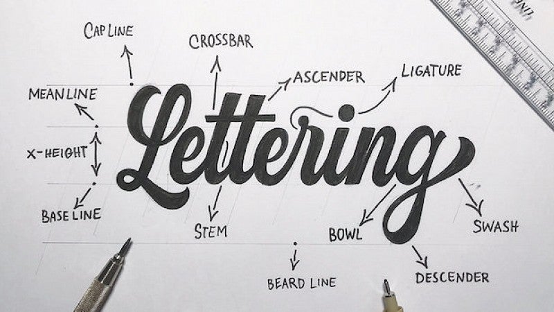
As a public relations major, I often envy the creativity and design capabilities of ad majors. Although we do dip our toes into some design, I am always trying to learn more.
I was fortunate enough to participate in advertising professor Steven Asbury’s typography workshop last spring term. Going into the class, I was unsure what to expect. I knew we were going to be learning the basics of InDesign, which I desperately needed, but I was eager to find out what else was in store.
Now I can’t look at typeface the same. Here are my greatest takeaways from the workshop.
1.Typography separates professionals from amateurs.
This might be pretty self-explanatory, but I had never noticed the difference words can make in an ad or design piece. After taking this class, I understand the importance of typography. The simplest typography decisions can catch the eye and make a design complete.
I always thought the hardest part was actually designing the piece. In reality, the typography is what can make or break it.
2. KERN!
Ever wonder what it’s called when you move letters closer together? It’s kerning — and kerning can change everything about a word and the way it reads. It looks cleaner and more professional when your characters are proportionally spaced. It also makes the type easier to read.
3. Good design has a strategy behind it.
In public relations, every campaign and tactic needs a strategy. With design, knowing the demographics of your target audience audience can (and should) have an impact on the design you create.
Even though we are not all typography experts, words can affect us differently based on how they are visually presented. They also influence our perception of a brand. A change in design could impact a company’s sales dramatically, so it’s important to be strategic.
4. Avoid novelties.
We were taught to never, ever, ever to use Comic Sans. At first, I didn’t understand the reasoning behind this. But Steven showed us an example of an office sign written in Comic Sans. The sign immediately was read in a humorous manner and juvenile tone.
That said, there are also some accessibility issues that argue for Comic Sans.
The lesson here is that typeface can completely change the way a message is interpreted. When deciding on a typeface, it’s always a good idea to stick with the classics.
5. Helvetica is the most-used font.
This may or may not surprise you, but I was astonished to learn how often Helvetica is used. It is the most recognizable typeface — there’s even a documentary about it!
Helvetica is featured in numerous brand logos: American Airlines, American Apparel, Crate and Barrel, Dole, Harley Davidson, Target, Toyota, Motorola, Oral-B, BMW, General Motors, JCPenney, Jeep, Kawasaki, Knoll, Microsoft, Nars, Scotch, Skype, Panasonic and The North Face, just to name a few. I was shocked that I had never noticed this despite seeing these logos on a daily basis.
Although I do not see a career in design in my future, I now feel more comfortable with Photoshop and InDesign, and I know I will carry over these skills into my career and future. I also have a new appreciation for designers. Their jobs are both hard and beautiful. I admire those who have the eye to create gorgeous typography.
Story by Bella Barilati ’19
Bella Barilati graduated from the SOJC with a degree in public relations and a minor in nonprofit work in spring 2019. She is currently an associate account executive at Jack Morton Worldwide in Santa Cruz, California.
